
THE IDEA
CATHOLinktober is a creative challenge derived from Jake Parker’s Inktober, featuring Catholic themes. Every day, for the whole of October, the challenge is to create a piece of art, design, or content that would be inspired by the prompt of the day.
It was first launched by @alwayseteverywhere and @gustavoilustrador on Instagram.
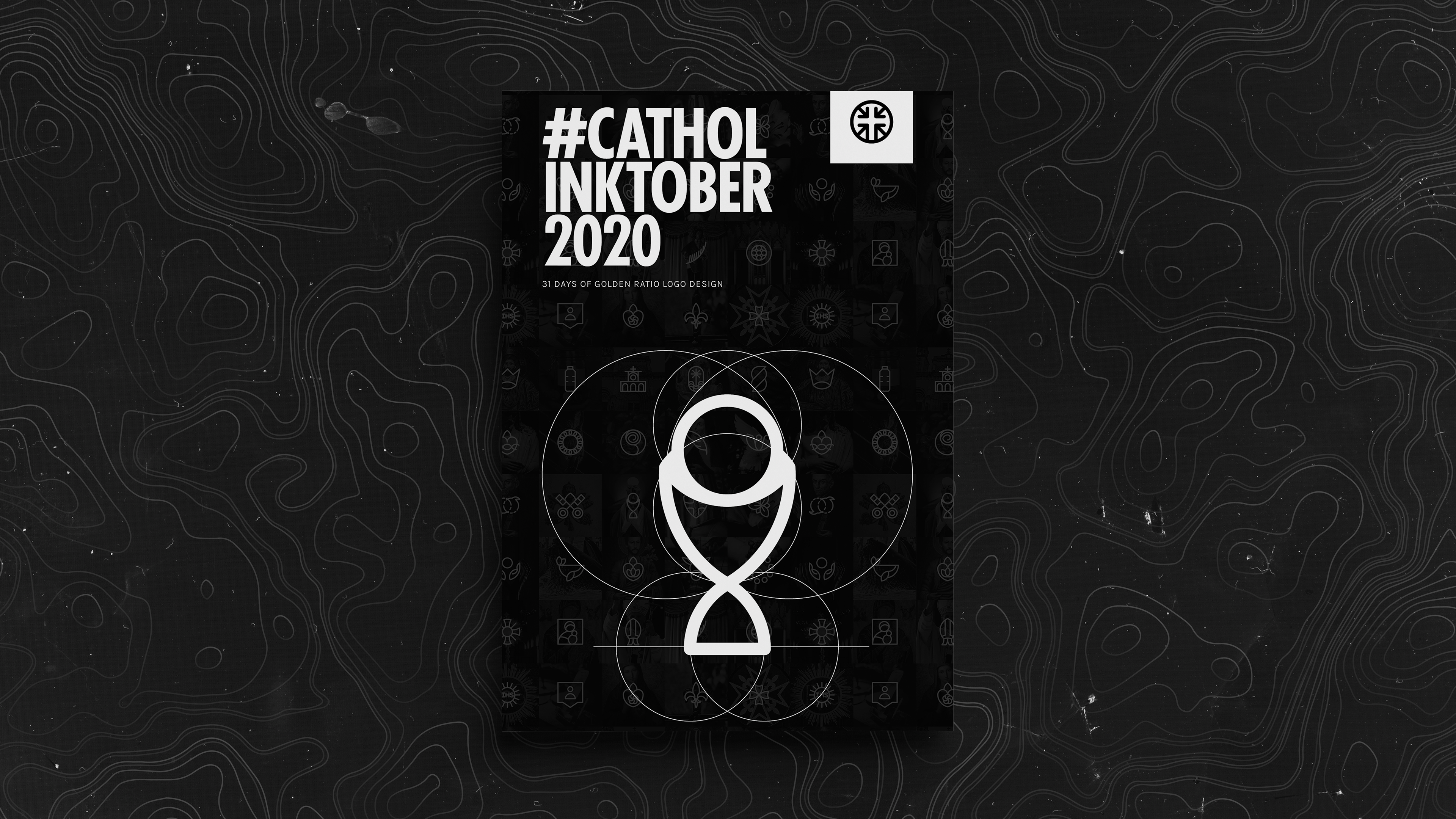
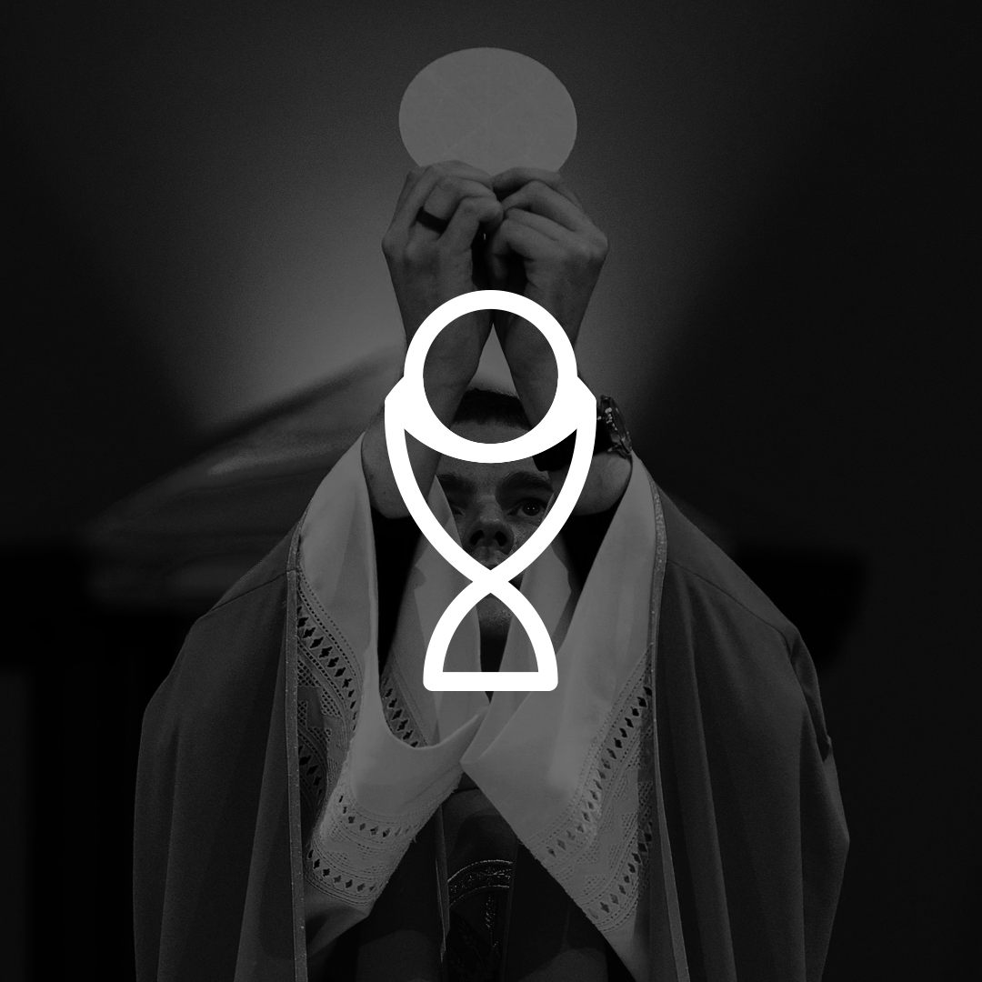
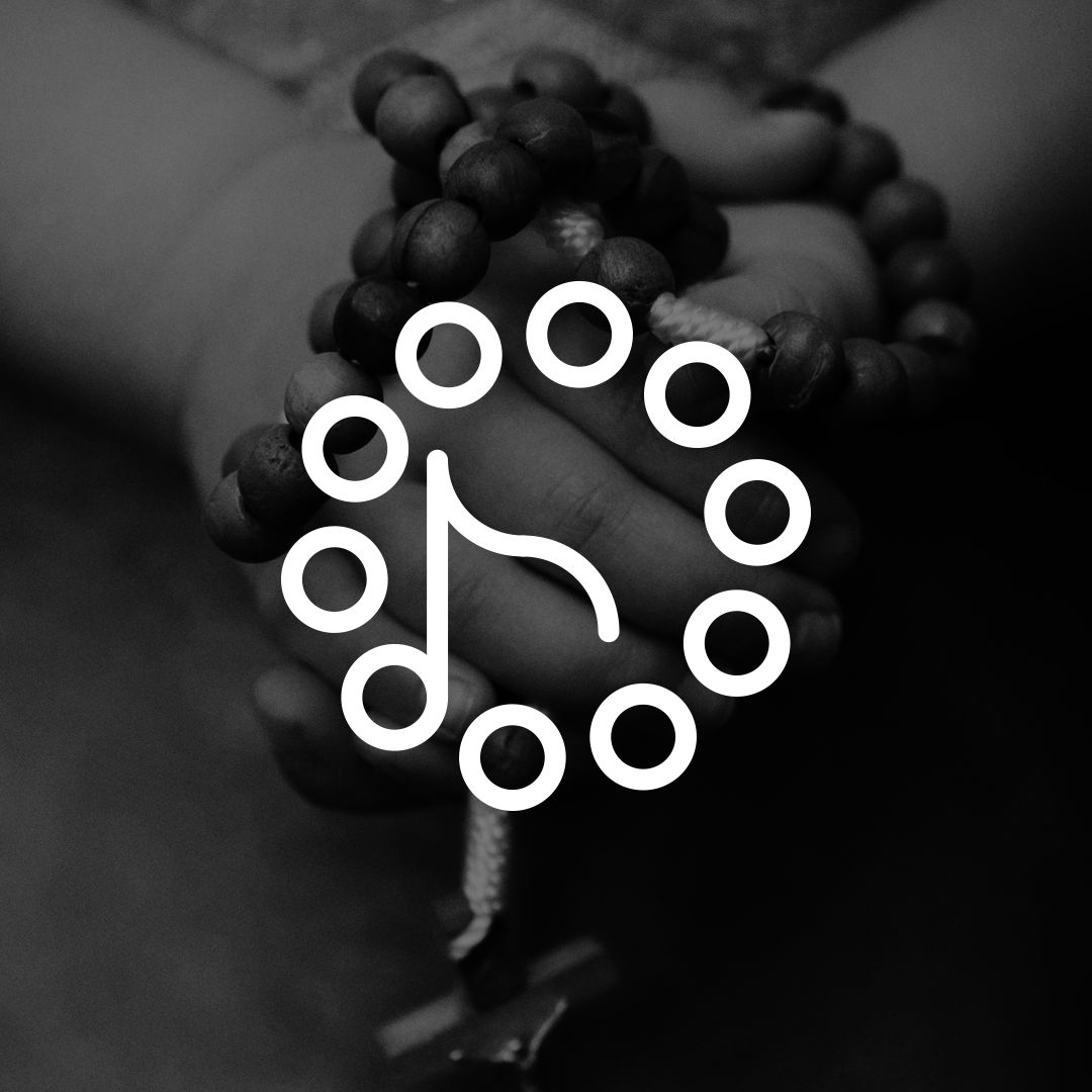
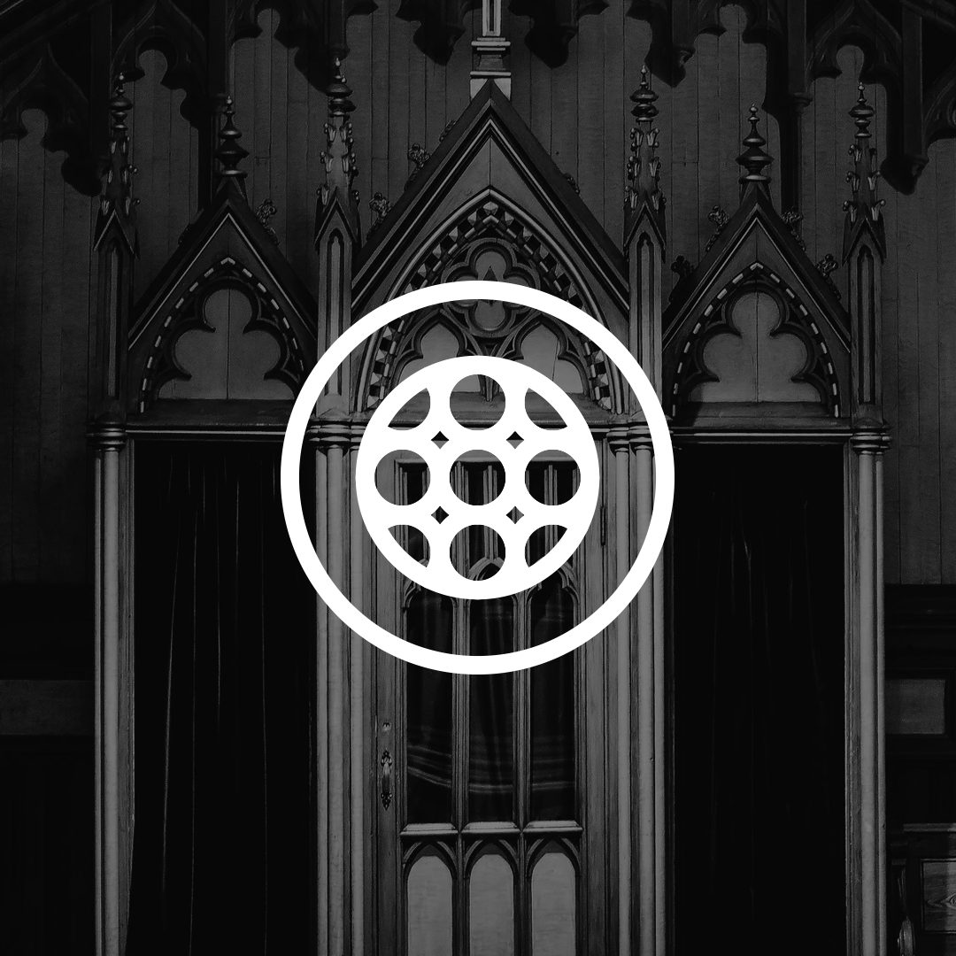
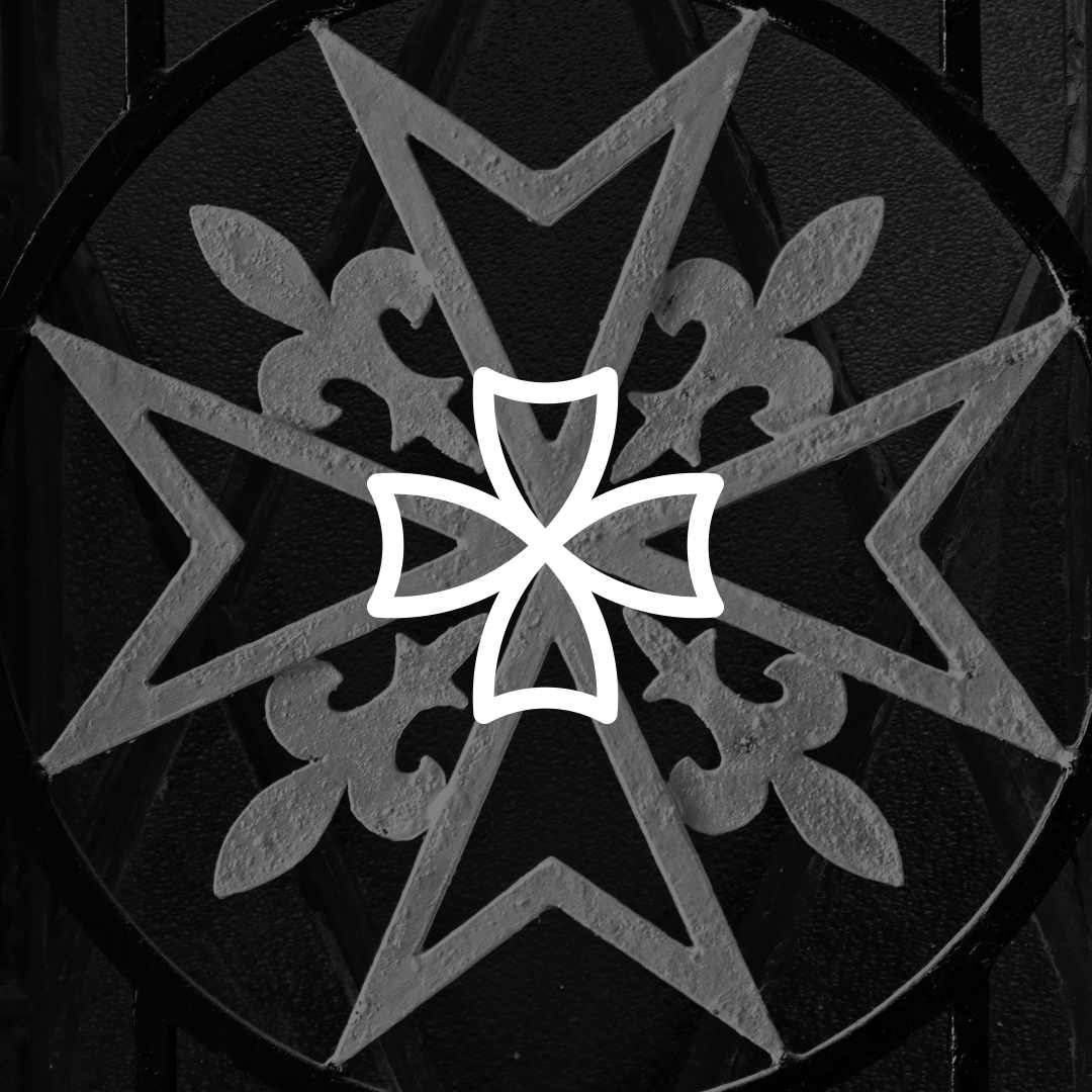
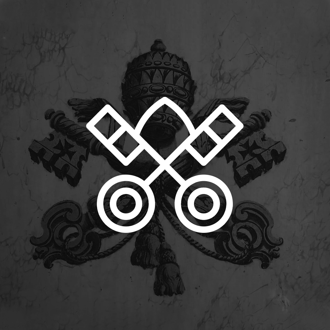
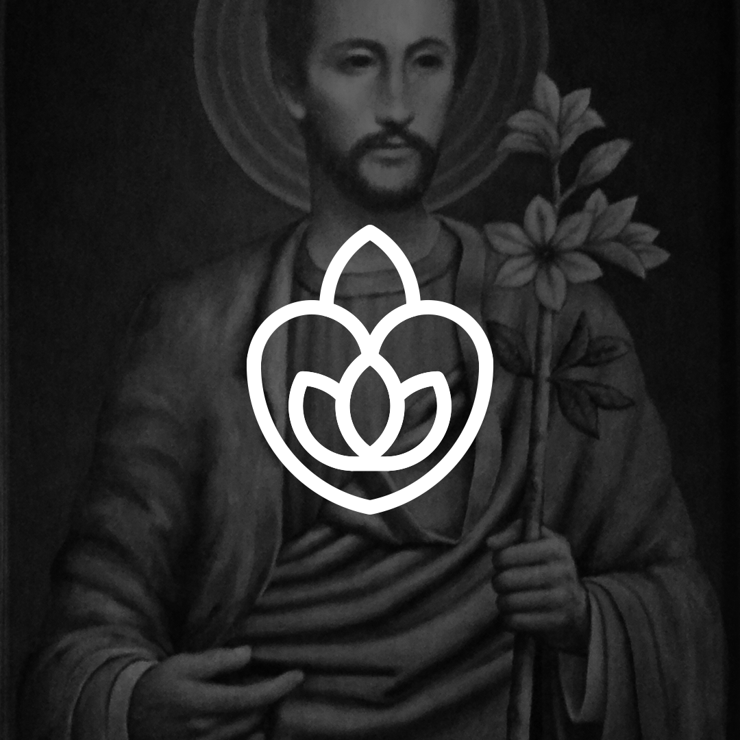
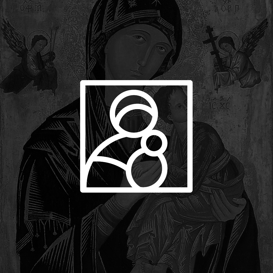
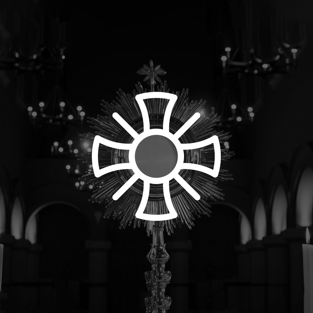
I decided to have a theme for the challenges, and it was to make Golden Ratio logos. I haven’t done a lot of logos this way, and I thought that it’d be good practice to learn the proper way to do it.
THE PROCESS
Preparation & Rules
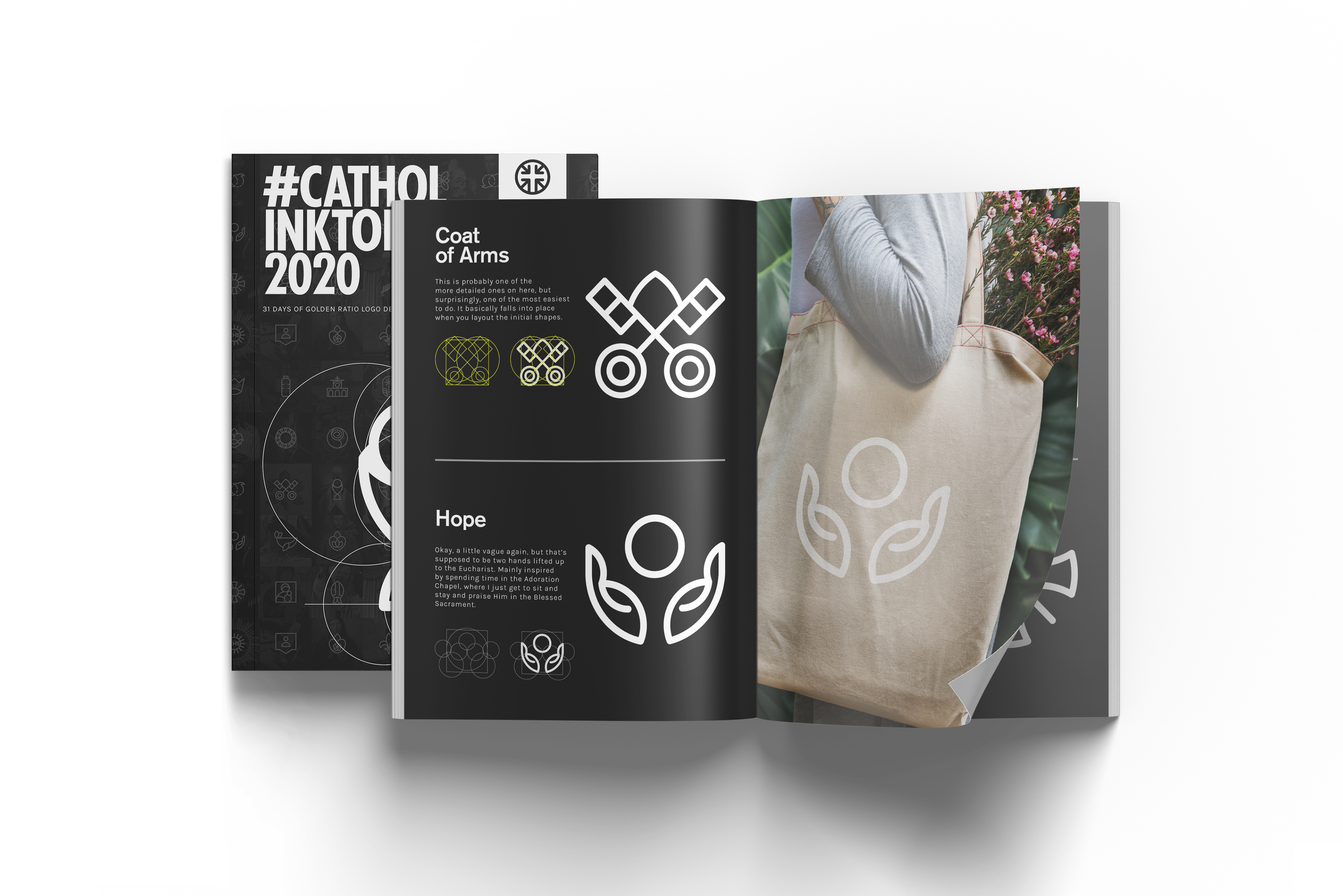
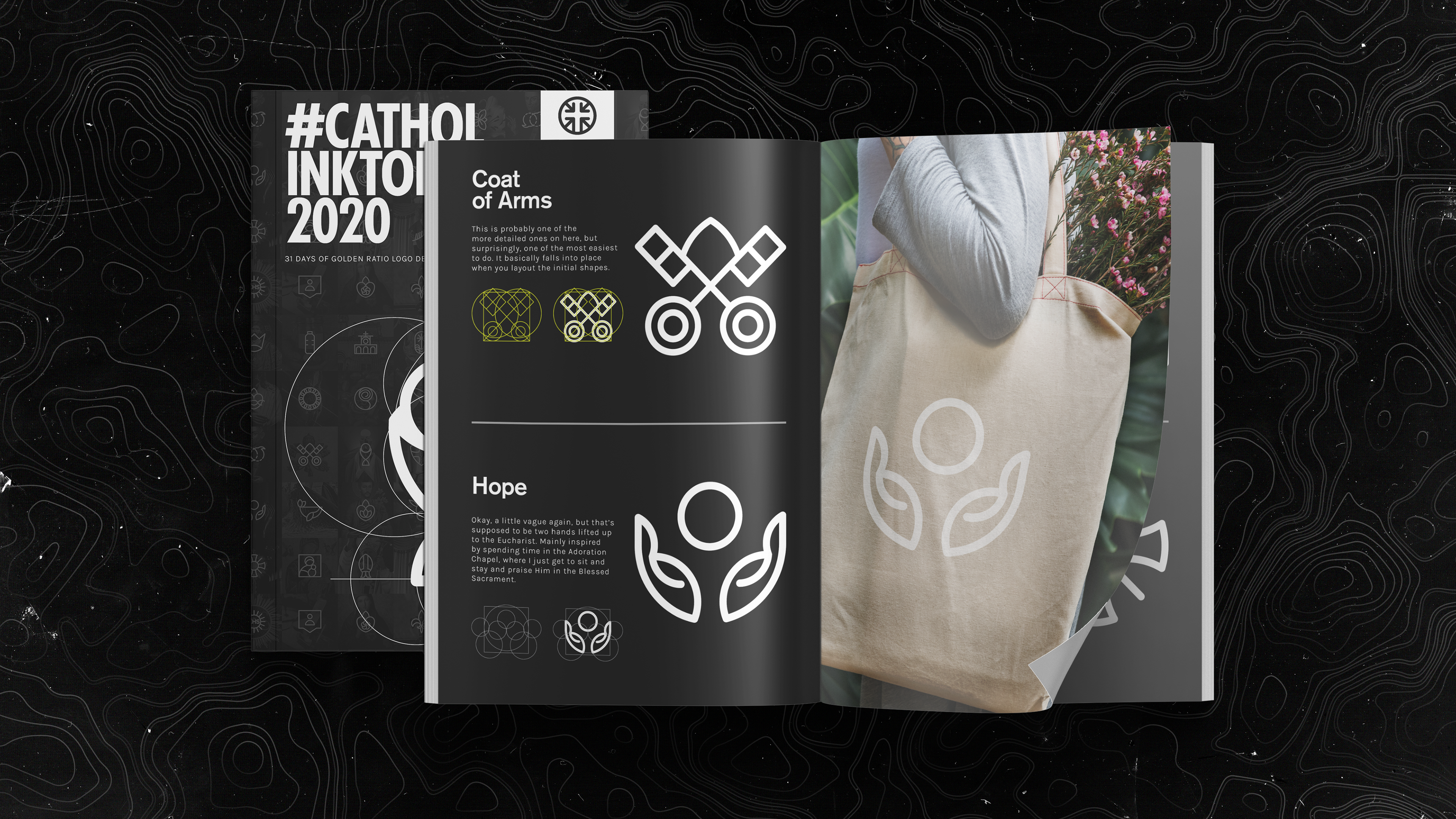
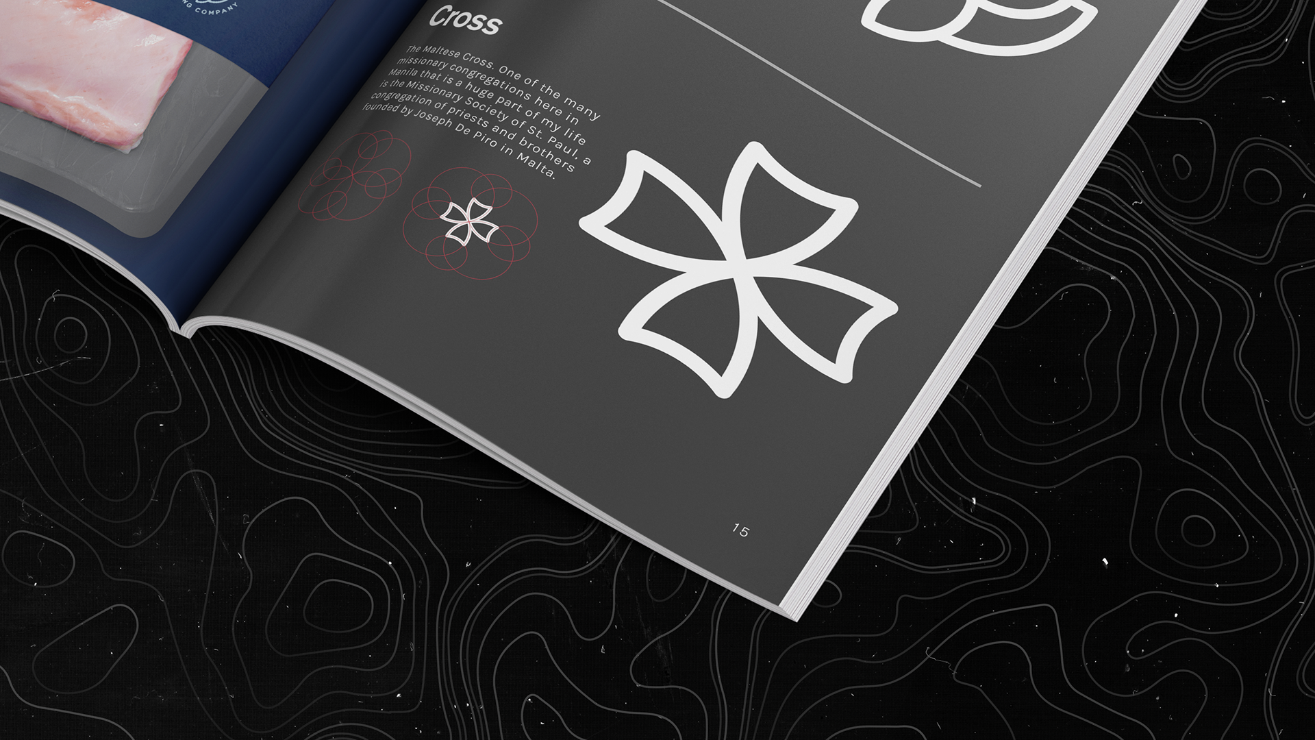
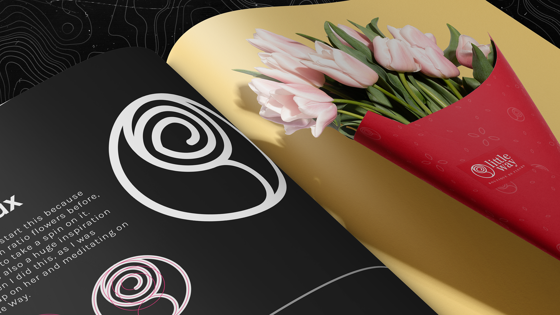
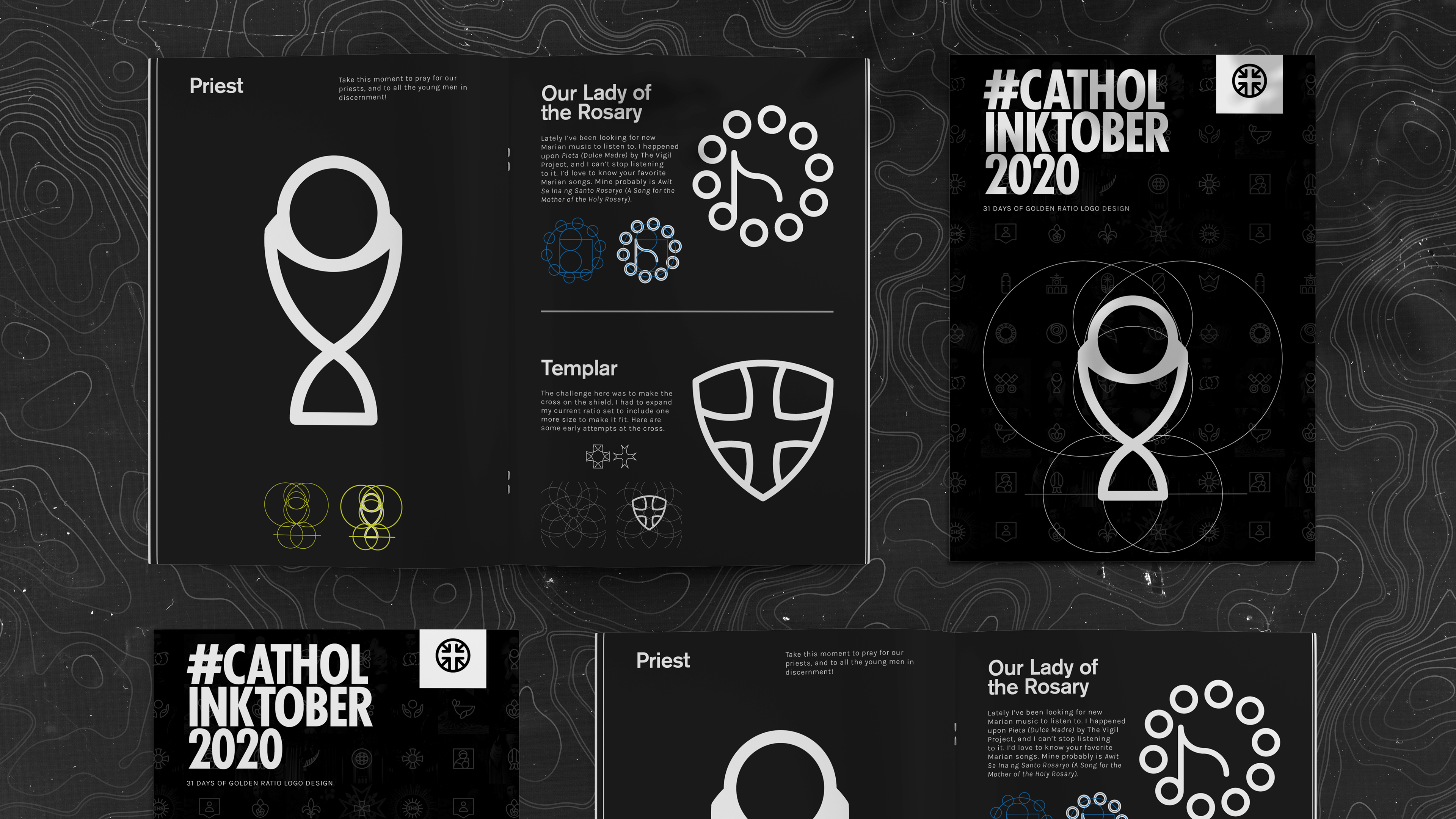
So I built the sequence as a guide, and used those objects to build my logos, arranging them in a way to form images. I’ve set some rules for myself and here they are as follows: 1) only use the circles and squares in ratio as the main object-builder, 2) can use straight lines if necessary to the illustration, and 3) can only use the same stroke weight for all the logos.
So I built the sequence as a guide, and used those objects to build my logos, arranging them in a way to form images. I’ve set some rules for myself and here they are as follows: 1) only use the circles and squares in ratio as the main object-builder, 2) can use straight lines if necessary to the illustration, and 3) can only use the same stroke weight for all the logos.
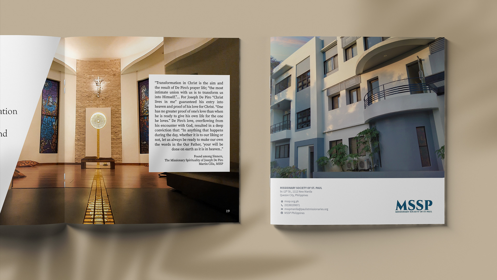
These logos were made in vector through Adobe Illustrator.
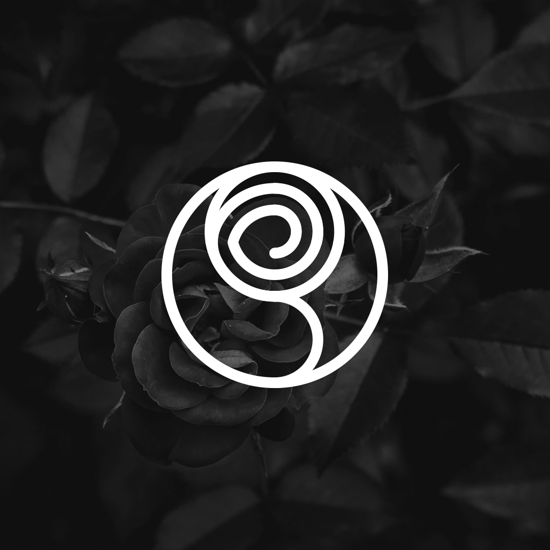
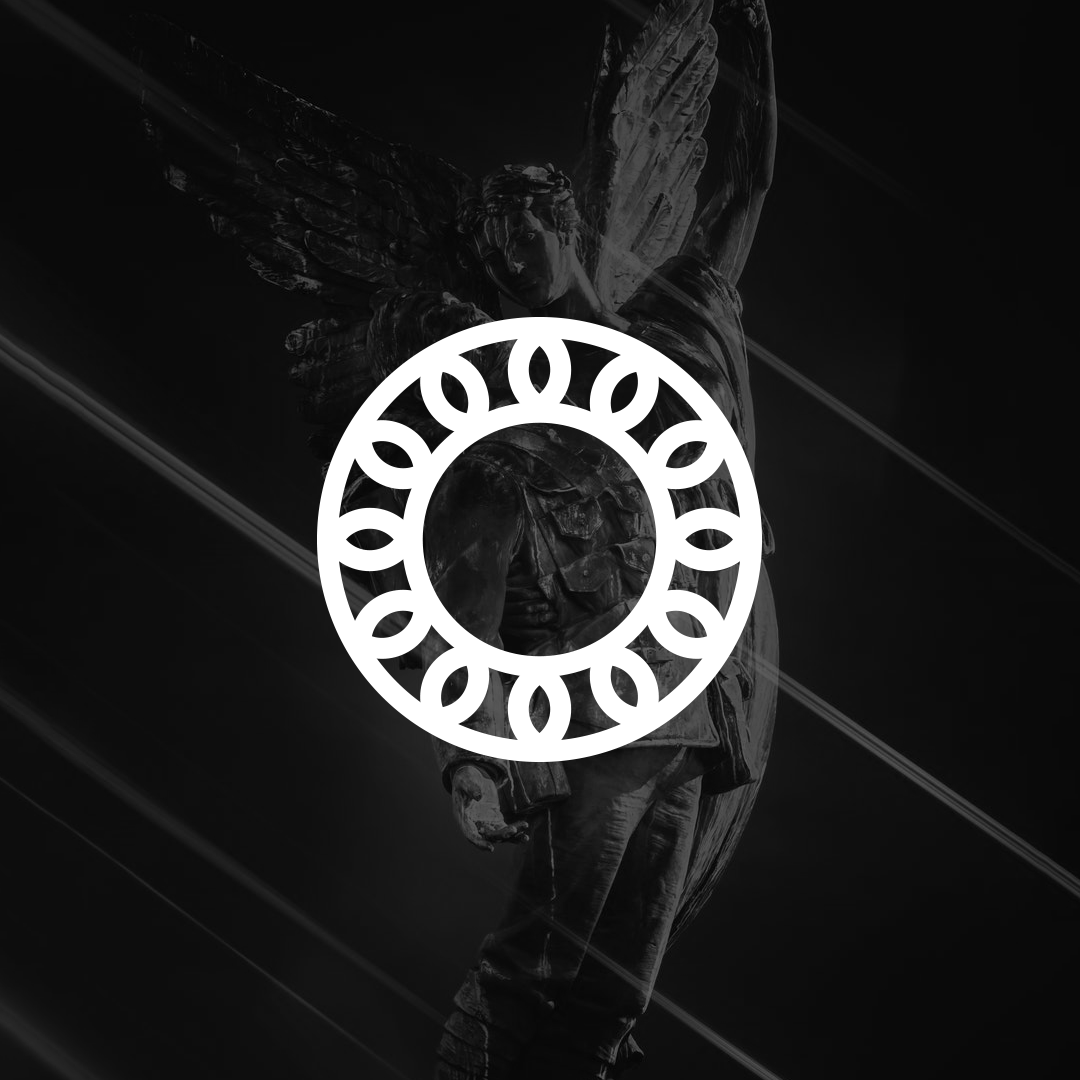
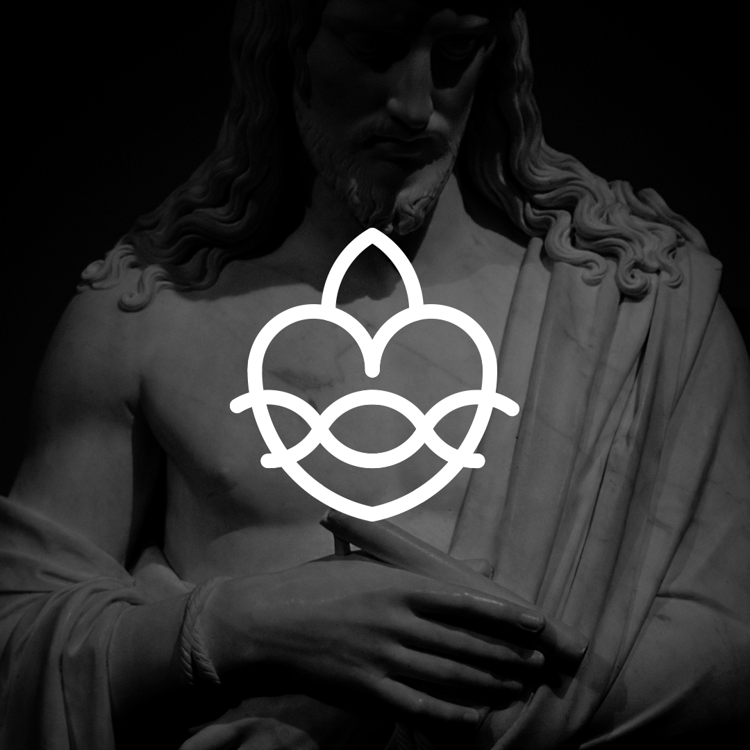
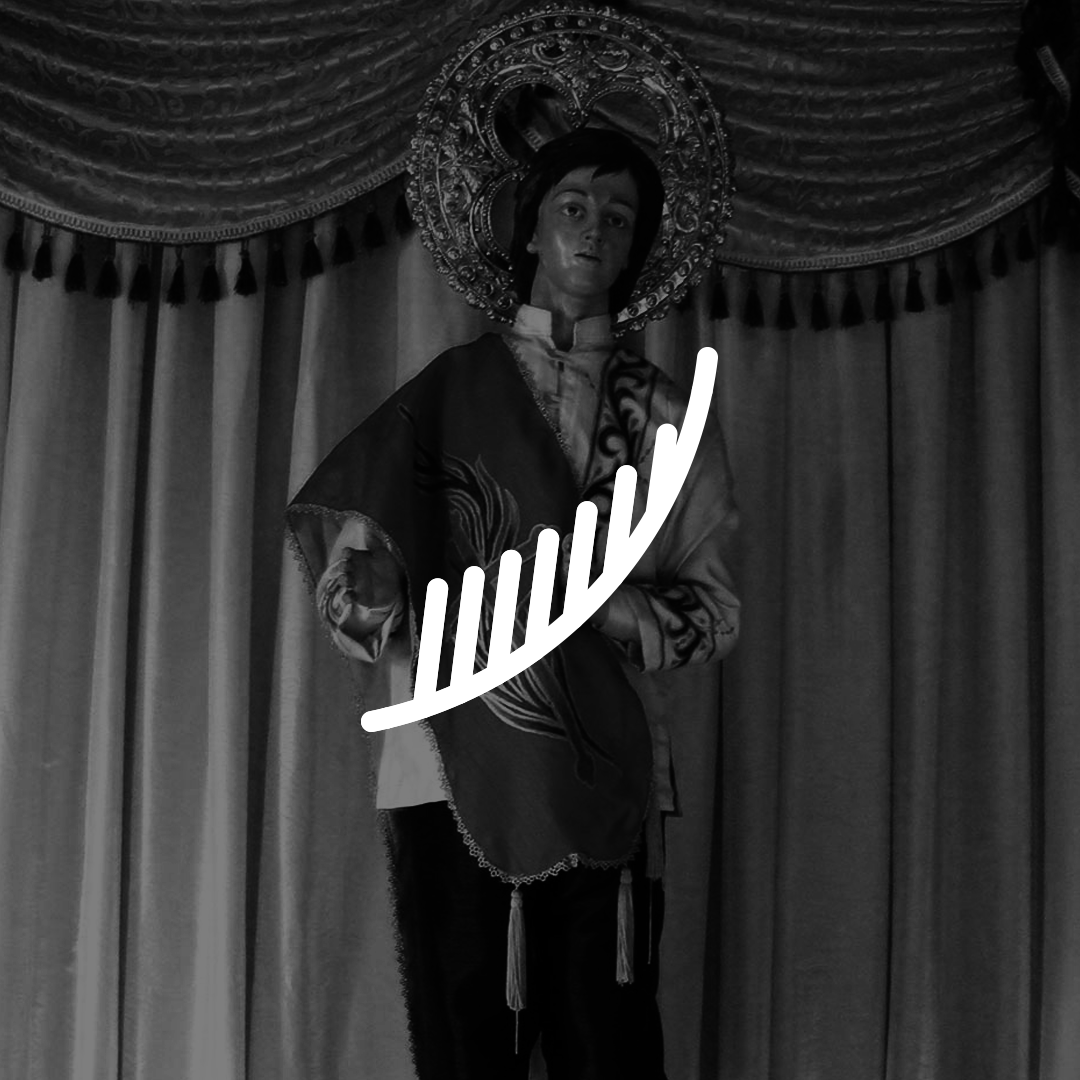
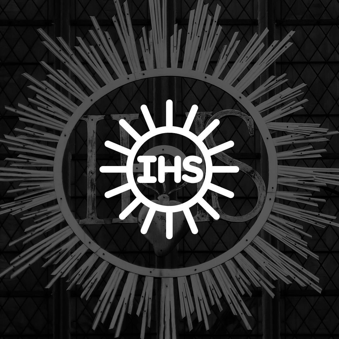
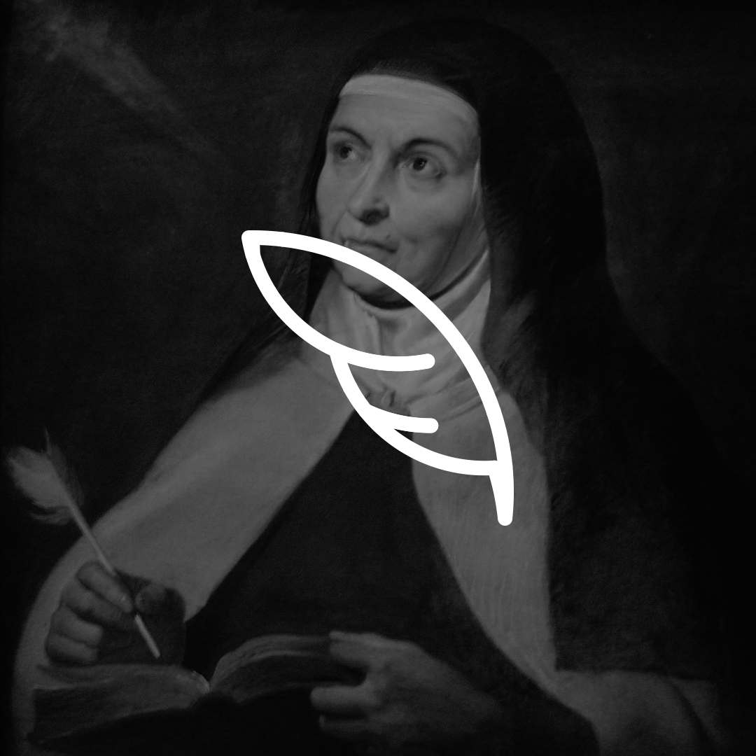
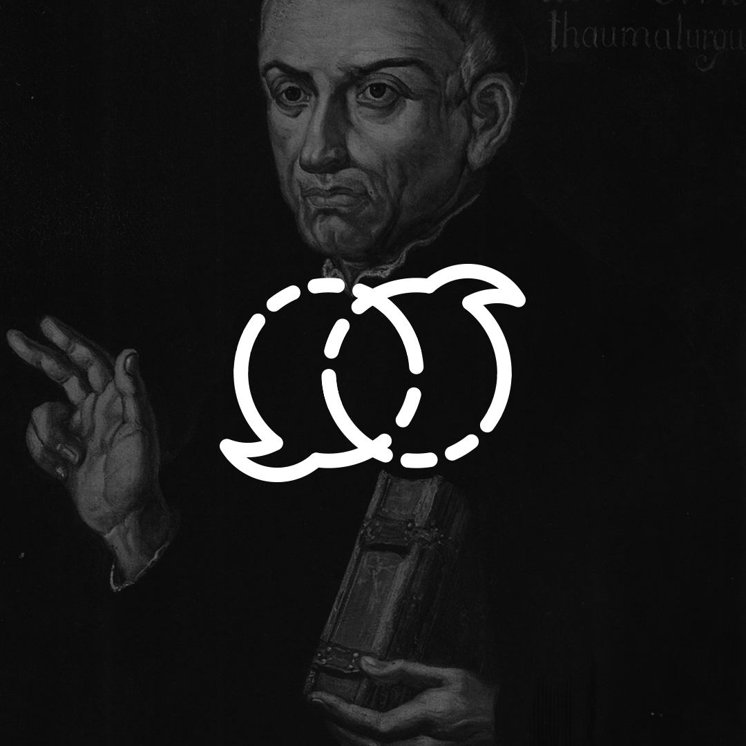
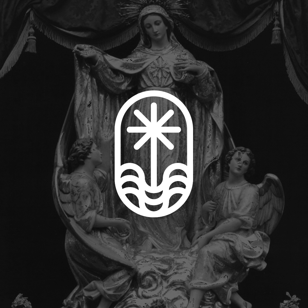
THE LOGOS


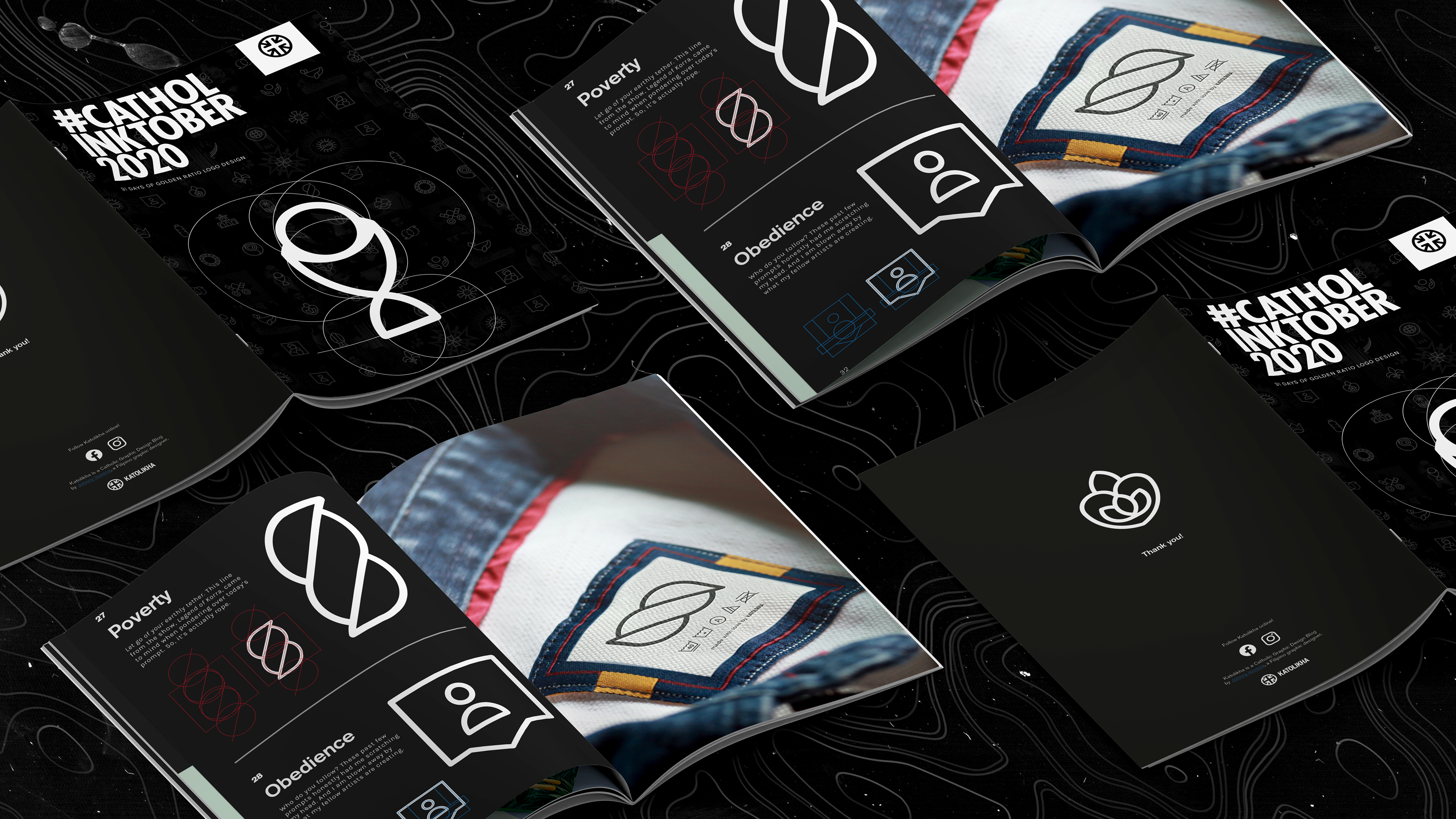
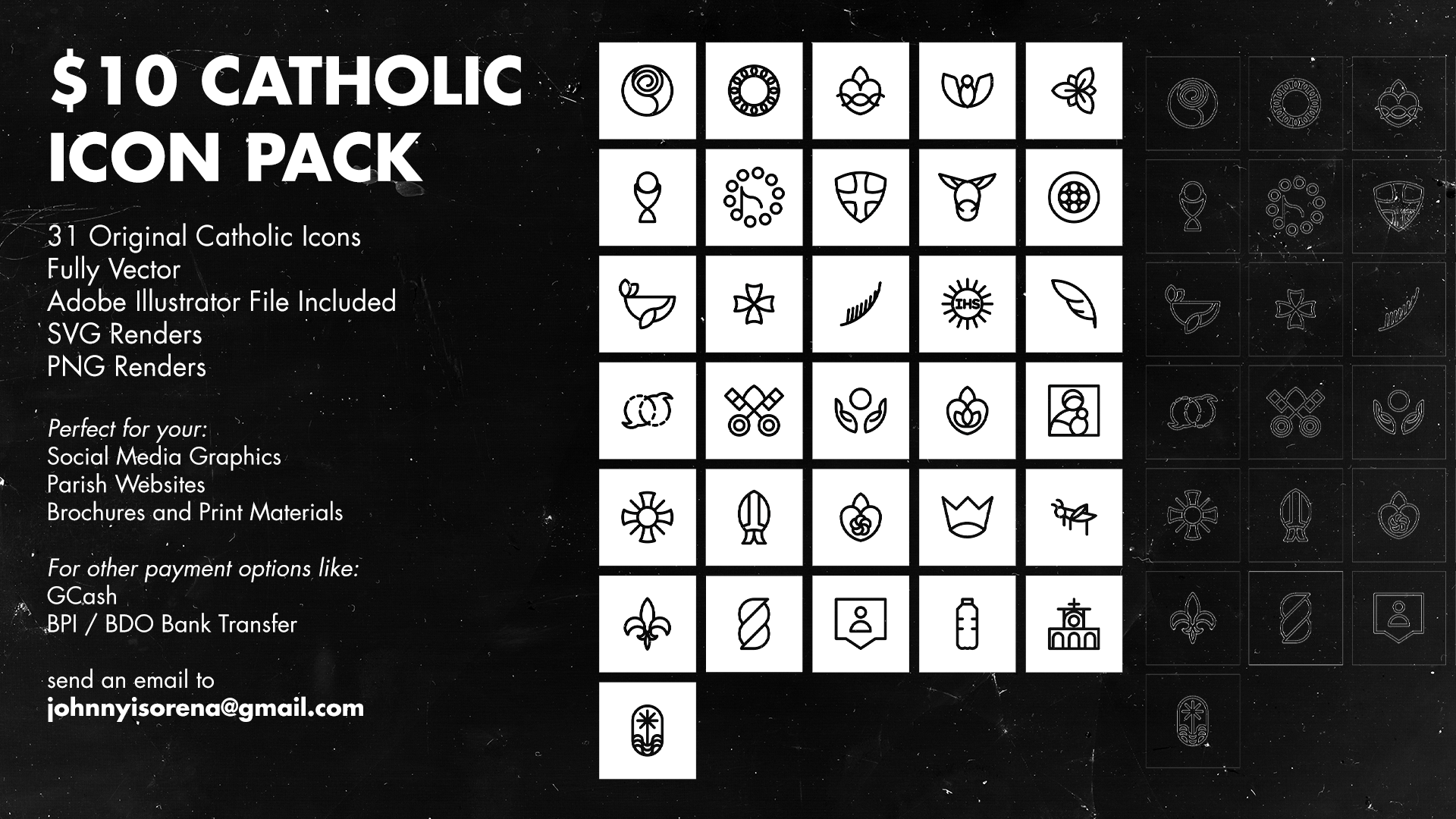
DIGITAL ART ZINE + CATHOLIC ICON PACK
After the challenge, I also tested these logos out to see if they’d actually work as intended. You’ll see some of the logos mocked up as made up brands in different mockups in a compilation digital zine I created. The document is available as a pay-what-you-can product through the link below.